We Walk You Through a Stunning Glebe Kitchen Renovation, From Start to Finish
Kitchen renovations frequently work to add functionality to the heart of the home, but how do you make it feel truly yours? There are any number of kitchen styles to catch the eye, after all. How do you find one that reflects your taste and vision?
You create it yourself, with help from experienced construction and renovation experts who take your style and vision and bring it into the real world.
At Sunter Homes, we’re always thrilled when our clients come to us with a clear vision in mind for their space. When our client approached us to renovate this kitchen in their Glebe home, they wanted to incorporate a Mexican theme while updating the space’s open concept.
Pair that with the possibilities of the home’s original 19th-century details, and we couldn’t help but get excited about this project.
“This was a very cool and exciting project for us,” said Jon Brandt, Sunter Homes’ Lead Foreman. “It was different from most jobs that we’ve done with regards to the kitchen cabinetry layout and even the overall storage space.”
Let’s take a closer look at this stunning Glebe kitchen renovation and how we brought it to life.
Style, Storage, and Function
Despite the kitchen’s original open concept, there wasn’t much practicality in its layout.
The range once sat against the wall where the pantry now rests, tucked tightly next to the arched entrance at the back of the kitchen. That wall, backing onto a beautifully tiled hall, was broken up by a second doorway.
It was very important to the homeowner to maintain that back entrance and its second-storey staircase. The already-tight arched entrance got some relief with the installation of angled base cabinets, and we were able to maintain the amount of storage with continuous shelving over the entrance.
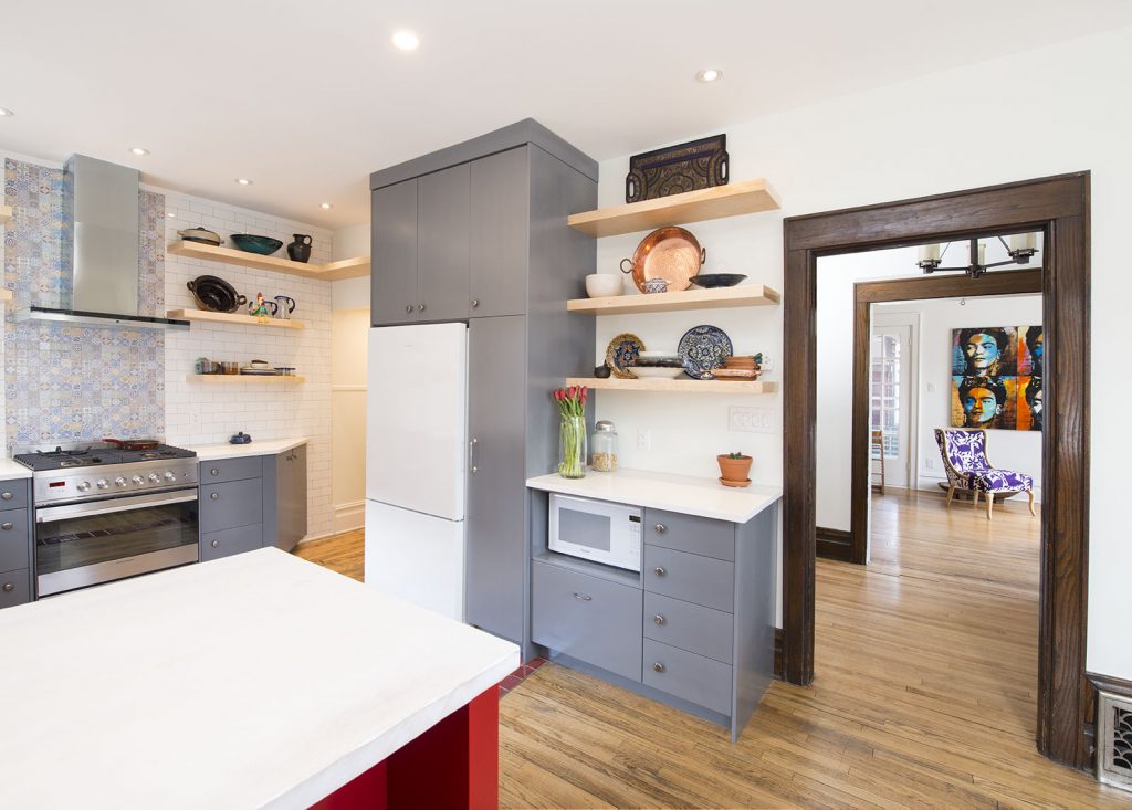
We knew that closing that second doorway would help define the kitchen more and create an opportunity to add more storage and counter space. This also gave us an opportunity to find a new home for the range, which we relocated to its current space with a beautiful new vent hood.
By moving the range and sealing off the doorway, this created a perfect space for a pull-out pantry and open shelving storage to maintain the Mexican theme. We also found a new home for the fridge, tucking in alongside the pantry.
“Typically, we’d be using upper cabinets for most of the storage,” said Jon of the storage updates.
“In this project, we used all open shelving across one of the main walls. Basically, what we did was put a piece of solid backer for the shelves across the entire back of the kitchen. We then used ¾-inch plywood tiled across the kitchen’s back, and we put in cleats to receive what would look like floating shelves.”
This plywood backing was affixed to the wall, furred to ensure it was plumb. This allowed for a deeper stud cavity, which was then insulated using 2-pound closed cell spray foam.
The finished shelving is, simply put, stunning.
“It really added to the overall aesthetics of the kitchen,” added Jon.
Unique Details, Big and Small
We always find that the details make or break a space, and there’s a particular sort of satisfaction at seeing all these details come together to create a truly beautiful space.
One key detail in this Glebe kitchen renovation? The beautifully distressed flooring.
“All the floor was pre-existing,” said Jon. “The client wanted to maintain that distressed look across the hardwood floor, but we did have patches to do from where the old cabinets lay, as well as patches from the new layout.”
Quite a bit of darkening had taken place on the existing floors over the years, so it was up to us to match that distressed look on these patches.
“The new oak that we put in, we actually used a blowtorch to give it that distressed, weathered look,” said Jon. “We were able to stain and finish it from there, which matched up with the rest of the flooring quite nicely.”
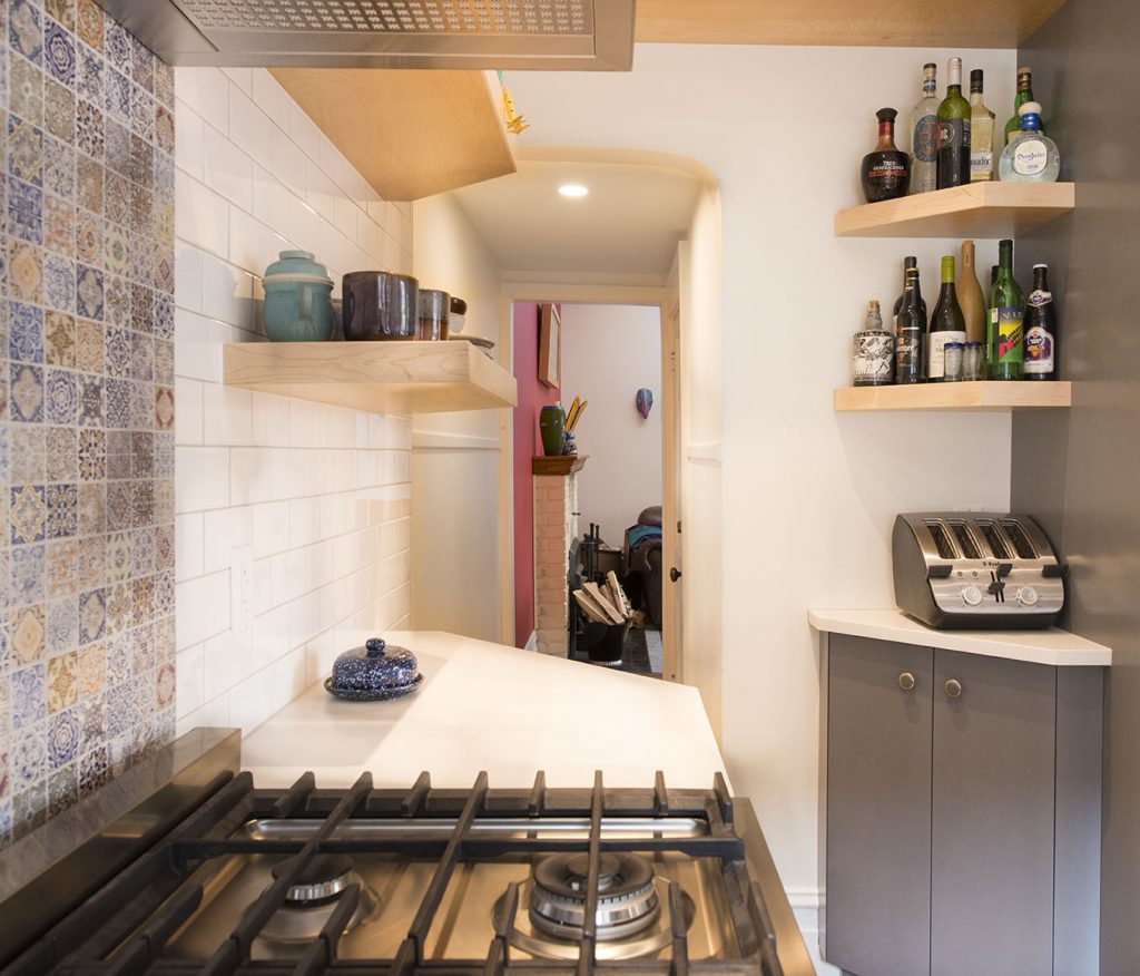
The rounded archway at the kitchen’s rear also presented an opportunity to tie a few beautiful details together.
“Moving into the hallway, it has a kind of subway look with the tiling. We had to tie in our wall tiles to this archway,” commented Jon. “It was a very neat look, moving from this vintage-looking, rounded-over, old-style archway to a Mexican mosaic back wall.”
That mosaic back wall is perfectly complemented by the white subway tile that frames it and a specially-made butcher block countertop that the owners distressed using chains, screws, and nails. The exposed vent hood, too, draws attention to the inset mosaic tile.
Stunning Colours to Match Theme
Colours were important, too.
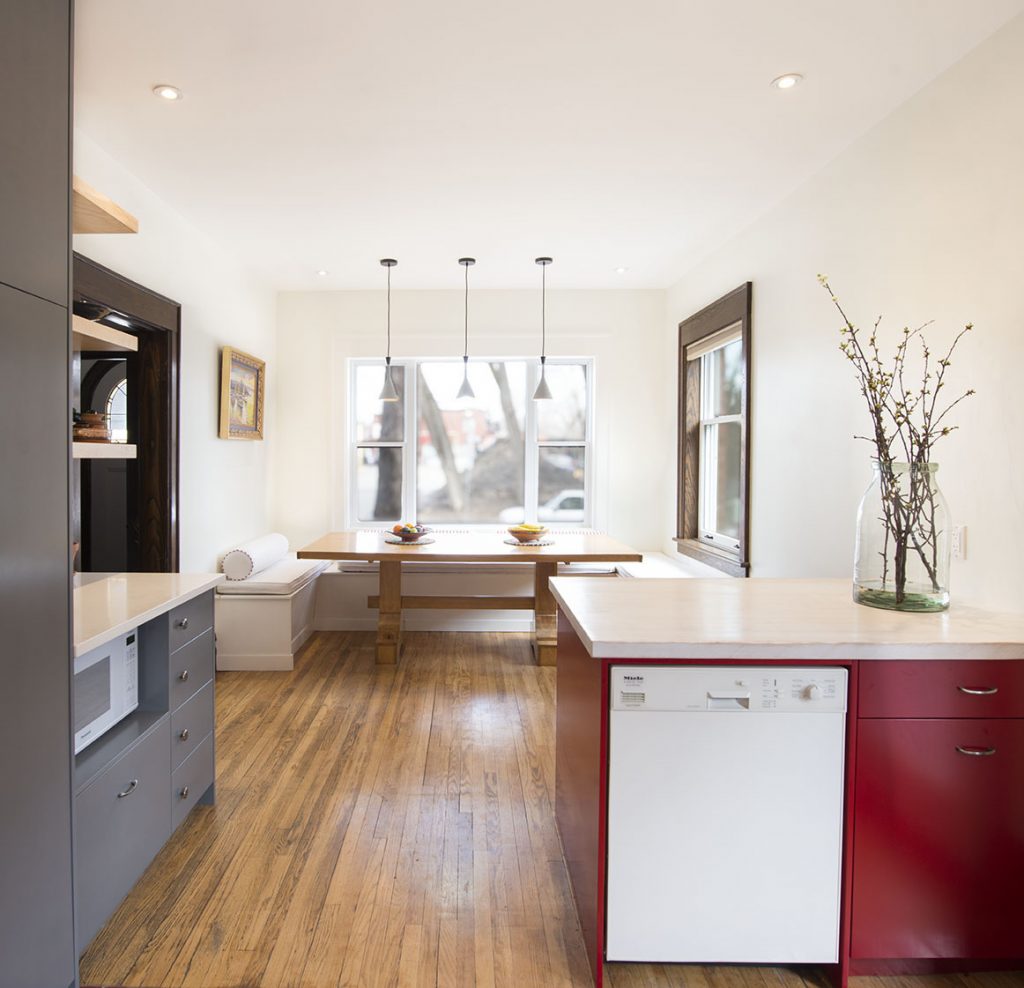
“The client with very rich colours for their cabinetry, as well as a very nice red peninsula coming off the wall with that distressed butcher block,” said Jon. “They used rich grey colours for the lowers in the kitchen.”
The clean white look of the fridge provides balance with the rich dark-grey pantry.
Keeping in line with the existing trim, we included a three-part trim assembly to match up with the early 1900s window casing.
“We brought in a lot of new, modern cabinetry, but all keeping in with the Mexican theme, which turned out very nicely, and really catches the eye with all that open shelving.”
Final Touches and Thoughts
In addition to the design and layout updates, we also replaced four old windows, one in the dining room two in the kitchen’s eating area, and one directly in the kitchen space proper, above the sink.
These windows offer plenty of natural light in what once felt like a very tight space, adding to the kitchen’s open feeling and appearance. From the big-picture layout changes to the small details and design touches, this project was a fantastic opportunity to pair our passion for exceptional quality and craftsmanship with a unique and eye-catching design.
“The client is quite happy with everything we laid out and discussed throughout the project,” shared Jon. “We came up with a few different solutions for transitions that had to be accomplished.”
It’s not every day that we get to use such an eclectic and unique design in a space, blending a mix of aesthetics that are eye-catching in their own right. We love seizing every opportunity we get to find the true potential in a space or home.
The results can be transformative, and we love the feeling of walking into a finished space almost as much as our clients do. Better still, in a home with so much character, there’s something great about being the team to get the job done and provide those finishing touches that tie everything together.
“You have a mix of the old 1900s trim with new windows, and this Mexican-themed open-concept space, which really pulled together everything they were doing with the floor,” commented Jon. “It turned out to be quite a lovely kitchen.”
We couldn’t agree more.